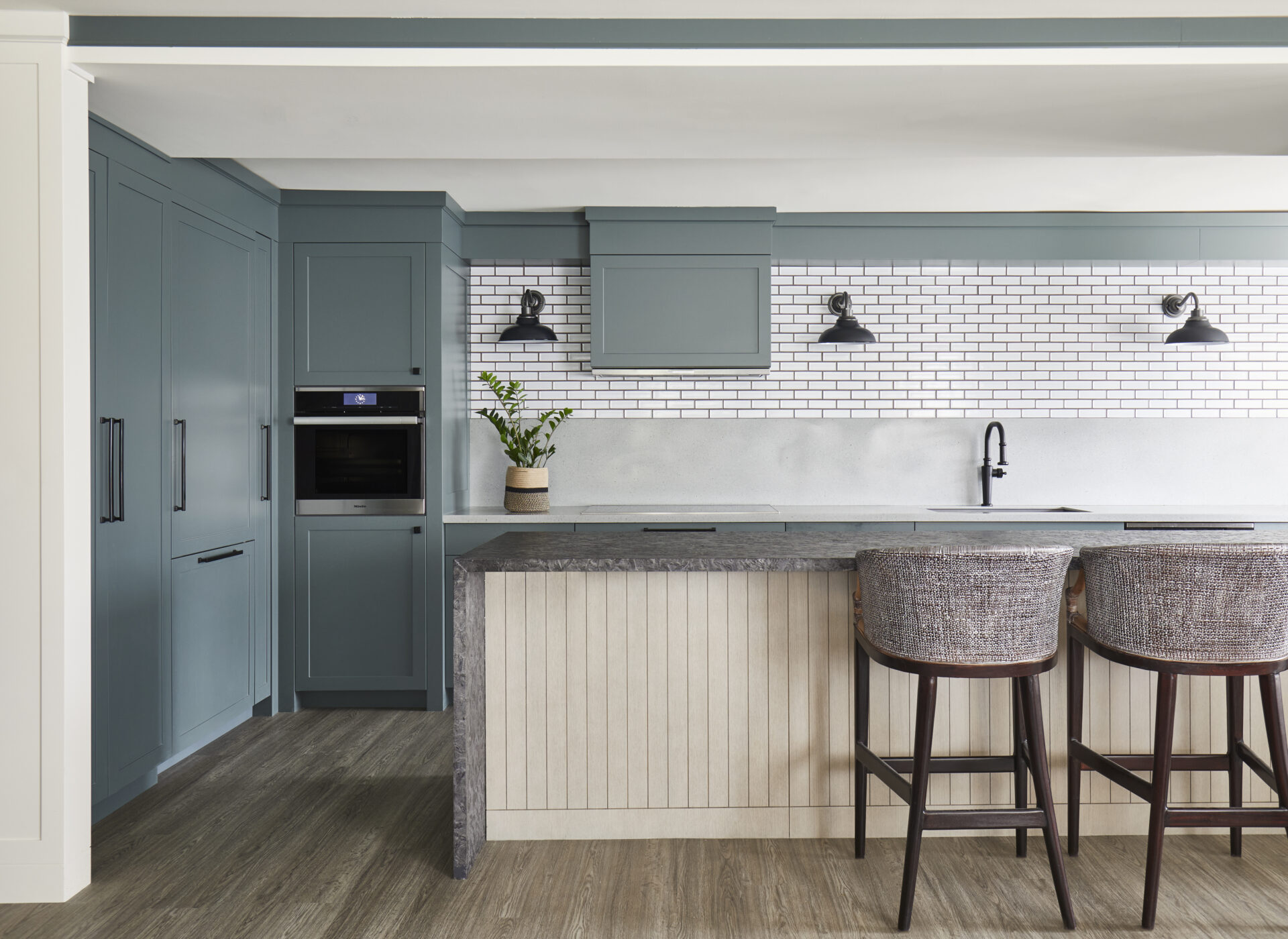
The colour chosen for the kitchen (Ben Moore’s Knoxville Gray) was inspired by the tones of Lake Ontario, grounding the space and drawing you in. A natural wood island front compliments the moody gray countertop and waterfall edge, capturing the heart of Toronto Interior Design beautifully by marrying elements of nature with a big city feel.
The alluring blue-green colour continues into the dining area, inviting a cohesive flow to the space. Intentional detailing on the ceiling was included as a way of framing the space and completing the design volumetrically.
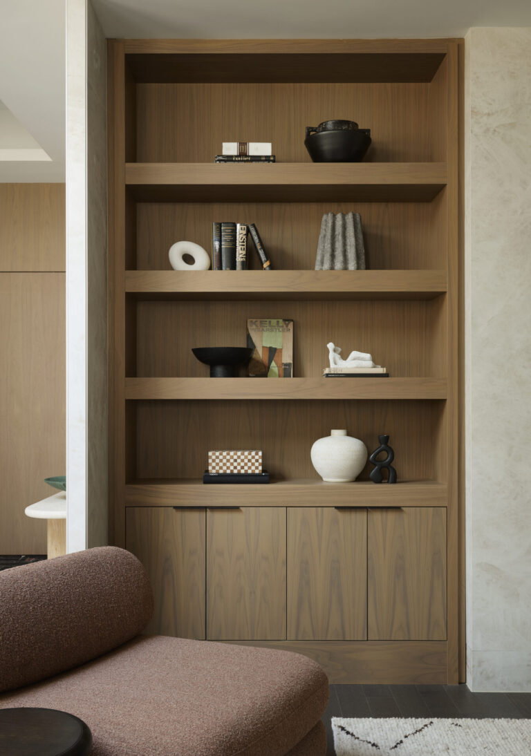
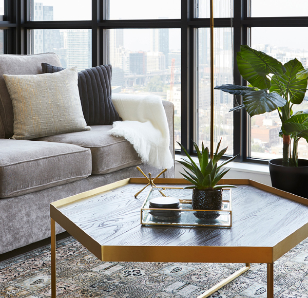
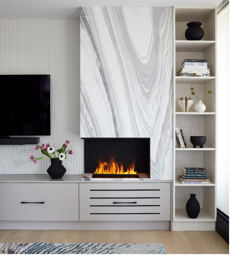
Moving into the living room, we deepened the custom built-ins to a night sky navy, adding depth to the condo while sticking close to the client’s vision. The shades of blue throughout compliment each other, with warmth being added through decor elements like natural linen throw cushions in warm creams and tans.
The powder room was the perfect place to add a touch of drama, further enhance the design and reflect the client’s personality.
Why red? The “Red Rule” claims that the addition of red – where you might not anticipate it – perfectly completes a space with just the right amount of unexpected interest!
To see more amazing shots of our Concord Project, follow this link.
Click here to find a LUX interior designer near me.
